Initial Cap Study

Here are some images (and their corresponding websites) that I found that I think illustrate different types of initial caps. I found some of the websites to be really helpful, and contained more reference images than the ones I’ve included
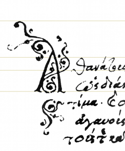
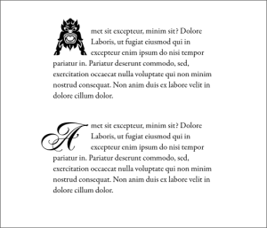
Greek Raised Drop Cap
http://www.w3.org/TR/2010/WD-xslfo20-20101216/

.

drop-caps_06
http://www.xaraxone.com/webxealot/workbook62/workbook_4.htm
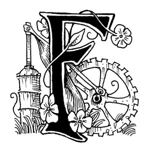
frank_Finitialcaps
http://grisgrimlysfrankenstein.blogspot.com/2012/09/f-is-for-frankenstein.html
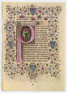
il_fullxfull-254893159
http://abcdefridays.blogspot.com/2014/09/drop-caps.html
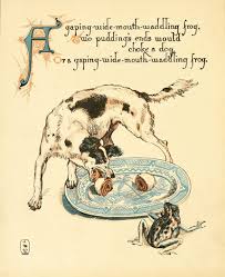
images
http://www.chroniclebooks.com/blog/2012/03/26/from-the-design-desk-making-the-modern-picture-book/
letter-g1
http://tokokoodemo.us/raakbookoo/shop/woo-single-2/
http://www.w3.org/TR/2010/WD-xslfo20-20101216/

Typography Scavenger Hunt

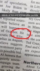
Words at the end of lines make it difficult to read and keep track of where you are. "He" is too short of a word to end a line after a period.
Words at the end of lines make it difficult to read and keep track of where you are. “He” is too short of a word to end a line after a period.
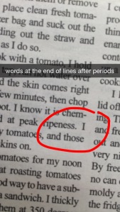
words at the end of lines after periods 2
Words at the end of lines after periods example 2
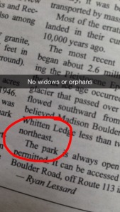
widows or orphans 2
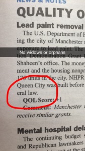
No widows or orphans example 2
having one word at the end of a paragraph that takes up a whole line look sloppy. In this case, it is a word and a half.
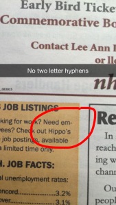
two letter hyphens make it difficult to read. Two letter hyphens create a distracting and odd shape to the body of text.
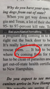
Bad punctuation formatting looks unprofessional.
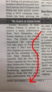
Rivers in a body of text create gaps in the text that seem to create a white 'river' of black space that can be distracting and visually unpleasing.
Rivers in a body of text create gaps in the text that seem to create a white ‘river’ of black space that can be distracting and visually unpleasing.
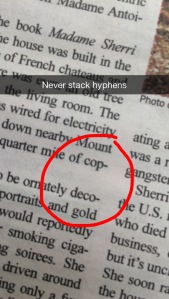
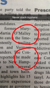
Stacked hyphens 2
Never stack hyphens part 2
stacked hyphens create visual disharmony. In this case, they are separated by a line, but they are still displeasing to look at. I have another example where they are back to back.
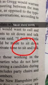
Stacked words make text hard to read. It becomes easy to lose your place, skip something, or read the same thing twice.
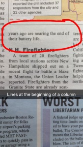
There should always be at least three lines to begin or end a column. Otherwise it looks incomplete.
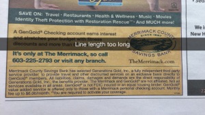
The line length here is too long for the point size . There are too many words, and becomes distracting and difficult to read.
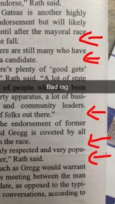
A bad rag creates an uneven edge on a block of text.
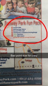
Bad point size for copy created a font size that is either too big or too small, making the text difficult to read or visually displeasing.
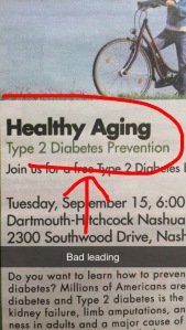
This is an example of bad leading because the two lines of type connect, when there should be a clear separation between lines of text.

font

This font, titled “Landscape Font,” by Gita Elek (http://www.awwwards.com/100-greatest-free-fonts-collection-for-2015.html) features the use of repetitive lines and shapes to create unity among the letters. Triangles and series’ of three lines are featured in many of the letters. The straight lines (examples seen on letters such as E,F, and H) juxtapose the triangular shapes (Examples in M, N, and W). The letters maintain a constant relative size throughout making reading them smooth and easy. Letters such as C,D, G, O, and Q are all based off a circular shape, linking them visually. The letters are not paced too far apart that it becomes hard to read, but they are also not too close that they blend together and become illegible. I was drawn to this font because of its twist on a traditional round shape font, with the use of added lines and triangular shapes and angles. It was generally pleasing to my eye and followed well letter to letter. The numerical characters follow the same patters and the letters, with the use of lines and angles.